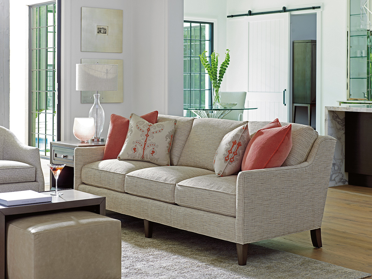
Spring has arrived and with that comes a feeling of rebirth, rejuvenation, and renewal. As you know, the spring season symbolizes hope, youth, love, and growth. With this in mind, spring is a great time to refresh yourself and your soul and even your home. One of the Pantone colors for spring 2020 is Coral Pink, which is a beautiful hue that is warm and welcoming, everything homeowners want their home to be. As the perfect combination of red and orange, PANTONE 14-1318 Coral Pink is a perfect color for this Spring.
If you’re looking for a way to refresh a room in your home or your entire home this spring with one of the Pantone Colors of the Season such as Coral Pink, there’s many ways to incorporate this color into the design. Whether it’s in a statement piece of furniture, the focal color in a fabric or wallpaper, or added as a pop of color in chic decor, Coral Pink is sure to add an air of warmth, vibrance, and beauty to your design. It’s also important to find a few colors that are complements to Coral Pink to complete your color palette. For a shade such as Coral Pink, with its orange and red undertones, you would be safe to choose a blue or green shade as a complementary color. If you opt to choose a shade of Coral Pink that’s more or less vibrant, you will want to ensure your complementary color is aligned. If the shade or Coral Pink that you choose is more muted, you will want to ensure your green or blue shade is muted as well. Playing with colors and complements is a great way to elevate your design and ensure your personality is shining through.
At Warren Barnett Interiors, our team of award-winning interior designers is committed to creating a space that matches your vision, personality, and lifestyle. Helping you choose the shades, textures, and pieces that make up the design of your dreams, our team is focused on you and your vision. If you have a space that needs to be renewed or refreshed this spring, contact us to get started with your complimentary consultation.
Comments are closed.